The new Bell Bradburn was designed to reflect the pure culture and lifestyle of the people who live and explore all the true benefits to living in Colorado. This state has truly magnificent outdoor attractions and sights to behold, whether it’s riding your mountain bike, camping in the wilderness, rafting through the waves of the rapids or fishing in its great rivers, Colorado’eans love their nature and take full advantage of this. This was the genesis of our designs, we wanted to bring the essence of the great outdoors to the “great indoors”. Warm colors and materials mixed with comforting textures and textiles are woven into the fabric of this lifestyle. Plaid textiles and Traditional styles along with abstract carpet patterns mixes these two worlds of modern and traditional together to create that warmth of your families living room. We used a lot of warm woods to add again this interior connection to the outdoors and woods that surround our Neighborhood.
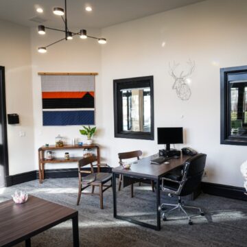
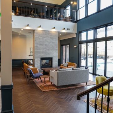
On the ground floor, we designed the main lobby lounge to feel as an extension to your living room. Adding in the warmth and color of wood flooring along with comfortable lounge seating while also creating 4 zones of seating. The furniture selections are a mixture of contemporary and modern with a touch of traditional to connect with the building’s architecture. The art work is an eclectic collection throughout to reflect the charm of traditional design elements in combination and harmony of the modern furniture design. This area allows guests to relax by the two-way fireplace to read their favorite book, connect with friends or work on their laptops by the warmth of the fireplace. It can also act as an extension to the leasing office to allow operations to conclude their tours with the potential tenants in this lounge space as they review any needed documents or floor plans.
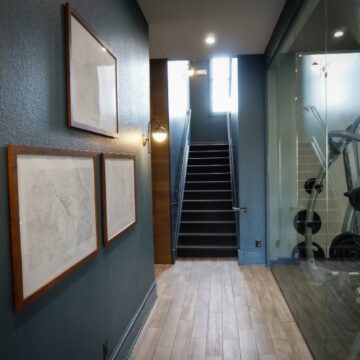
The concept of the gym was inspired by the vision of running through outdoor trails and rolling meadows with the installation of a fitness faux grass turf. This was our surprise and delight for the clubhouse, something unique that was not expected and something that would be memorable as future tenants toured through the amenity spaces. We wanted to break away from the typical rubber or vinyl tile flooring that every other gym has and embrace completely this outdoor themed design. Bringing the outdoors to the indoors is the overarching design direction. The Faux grass brings in the element of nature and color to the space, along with the resilience of gym use. Light walls to add the soft brightness along with the darker ceilings for coziness.
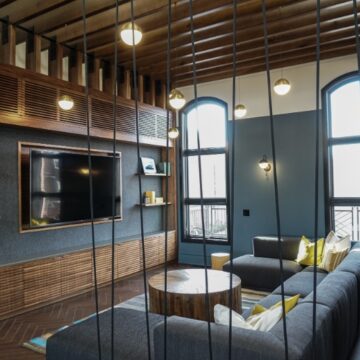
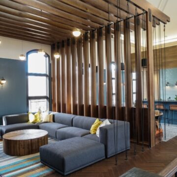
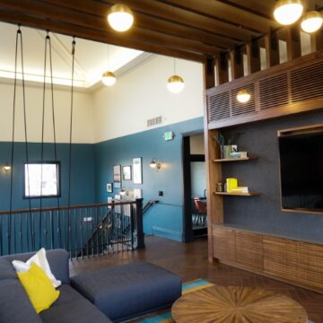
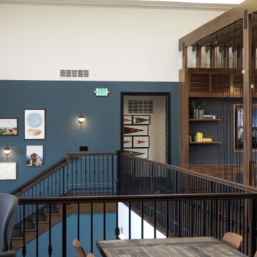
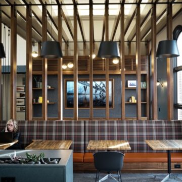
The second floor of the clubhouse was originally a large /vacuous open – monumental scale – space, which we felt lacked the human scale and comfort a gathering space should instill. We designed an interior trellis system out of wood and natural metal accents to bring the ceiling down and create comfortable seating zones. The new Trellis system spans a large soft sofa seating area and turns downward to form the back of a banquette seating space, blending the entertainment zone with the work / gathering / food and beverage zone. Wood flooring in connection with pebbled natural patterned carpet tiles compliment the wood trellis system to echo the outdoors within. The colors of the space are left in natural tones with punches of color to come from the art and furniture accents. The introduction of hanging accent pendent lights from the custom trellis system add to the curated human scale and coziness of the new spaces.
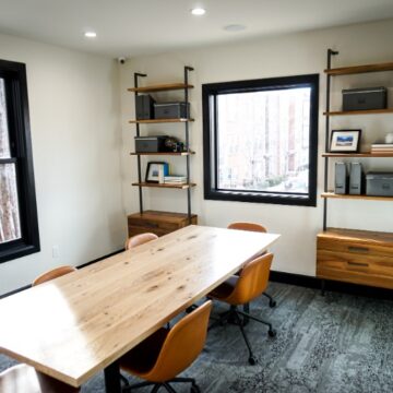
The large, locally sourced, communal table fosters a calling for community and a modern interpretation of a park bench with its striated wood construction.
The duality of the dark to light paint tones on the walls throughout the clubhouse was added to reduce the overall massive open space, and to add some color with darker warm color tones.
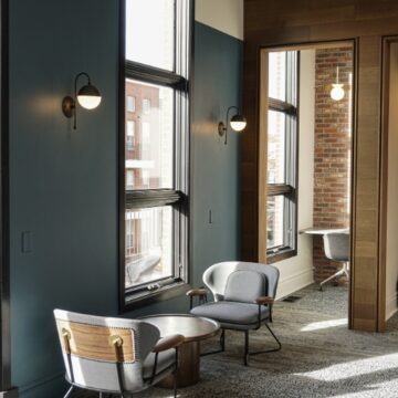
The old kitchen area was far too large for today’s needs or purpose and was concealed around the corner of the elevator shaft. We relocated the kitchen, allowing us to add in personalized meeting spaces for individuals to have private phone calls or meetings surround with tall beautiful walls with a warm brick accent wall and stunning pendent for intimate lighting. The kitchen was placed in the “Heart” of the second floor lounge as this is a place that everyone naturally congregates to, so why not celebrate and integrate it to our gathering spaces. We replaced the appliances to tailor it to today’s needs and brought in more natural elements such as wood planks to wrap the elevator wall that also connects to the kitchens accent tiled back splash. Accent lighting again on the back wall with wall sconces, to add a little drama and punch to the new tile wall and soapstone counter tops. Adding in a planter trough on the top of the dividing kitchen island from the banquette lounge seating area, brings some natural life and color to the space.
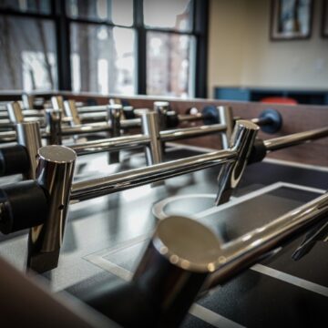
The Game Room is a fun whimsical space for both younger children and adults and families to be able to explore their creative natures and gaming needs. Using vintage retro gaming art pieces and video arcade play homage to the classic nature of the building as well but with the modern twist, carrying the outdoor theme again with the pebble nature looking carpet.
The yoga studio was upgraded with better lighting, a new acoustical sound absorbing fitness flooring to accommodate the uses of the space while improving the original sound transmissions to the lower level spaces. We added in a warm toned gray felt wall to both absorb the sounds from a hard surfaced space to prevent echoing and transmission to the outside spaces and a layer color and texture.

